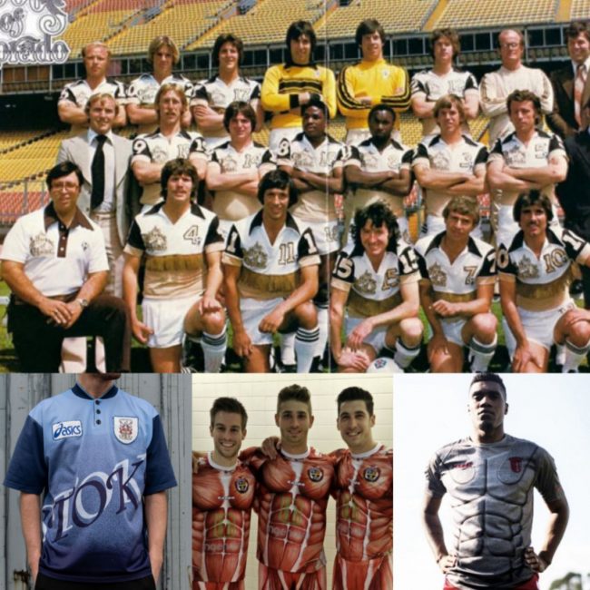
Football shirts have a rich and diverse history, with various different brands, colours and sponsors gracing the cotton of the tribal symbols that fight for victory week in, week out.
But sometimes, they just don’t hit the mark, and a team’s kit can become the joke of the season.
Betting.com looks back at some of the weirdest and most wonderful football kits in history, that sparked public conversation.
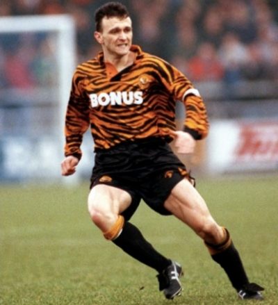
1. Hull City (Home Kit 1992/93)
Yes, we’re all aware Hull City are known as the fearsome Tigers, but this 1992/93 kit, arguably took things too far. The bizarre tiger-print design choice confused fans and players alike as it totally clashed with the football pitch.
Also Read: Ndidi Recovers From Injury, Resumes Training With Leicester City
Perhaps it would have been more suitable for a spot in Carole Baskin’s wardrobe instead?
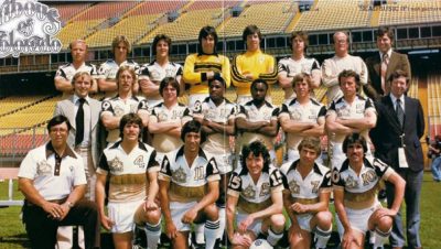
2. Colorado Caribous (Home Kit 1978)
Sadly, this ill-fated football club only lasted for a single season in 1978 before being dissolved. However, during the Colorado Caribous’ brief existence, they gifted football with one of the weirdest and most wonderful football kits of all time.
This unique shirt poses so many questions – what were the designers thinking?
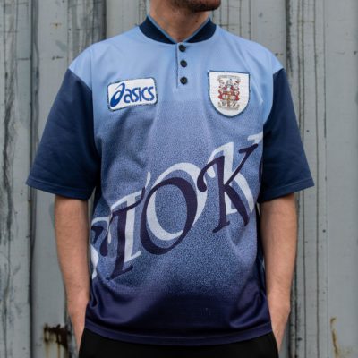
3. Stoke City (Away Kit 1996/97)
The 90s really were a questionable time for football kits and it is safe to say that this 1996/97 Stoke City shirt is a total stinker.
From the pyjama-style button-up colour to the clip-art font scrawled across the shirt – this kit is a total eye-sore!

4. Atletico Madrid (Away Kit 2004/05)
Sometimes bizarre can be brilliant. Football and films rarely collide, but way back in 2004, Atletico Madrid teamed up with your friendly neighbourhood superhero to promote ‘Spider-Man 2’.
Also Read: Simon, Amoo Nominated For CAF Player Of The Year Award
This kit is very of its time, and much like the Spider-Man films themselves, Atletico Madrid’s kits have undergone several revamps and reboots since the early noughties.
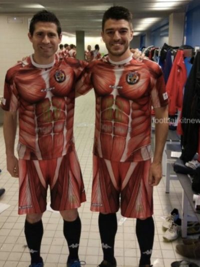
5. CD Palencia (Play-off Kit 2016/17)
Looking like something straight out of a horror movie, to say this kit was horrifying would be very apt.
The design, intended to show how willing the Spanish 3rd Division team are to ‘give their skin’ for their team’s cause, was put together by Juan Francisco Martin.
The shirt and shorts display a print of human anatomy with the muscles coloured in a searing pink – some things aren’t meant to be on display.
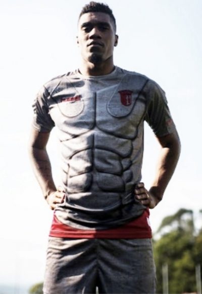
6. Sporting Braga (Third Kit 2019/20)
If CD Palencia made it obvious that football kits with human-like features just don’t work – Sporting Braga didn’t get the memo.
Based on Ancient Roman body armour, this bizarre kit complete with silver six-pack is a cool concept for a comic book, but just doesn’t work on the football pitch.


